

I love charts and the way they can be put together, because they always tell a story.
Charts have a way of illustrating things that numbers or words just can’t.
The chart below shows the history of the S&P 500 (the top 500 stocks in the US) going back to 1950.
The blue areas are bull markets (rising markets), and the red areas are bear markets (market crashes).
Take some time to consider this chart.
We fear investing because of the red.
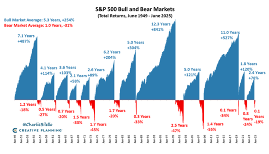
And yet, looking at it framed this way, it becomes quite clear that:
- The blue completely dominates the red, both in frequency and in quantum.
- The red shows up about once every ten years.
That second point is important. It’s why I tell people in their 50s, with a term of another 50 years ahead of them, that they will experience another five major crashes.
The question then is: should we be trying to avoid these crashes? Well, the cost of avoiding the red is missing out on the blue.
The stock market is not for everyone.
One option is to build a property portfolio and collect rental income. Property is tangible — bricks and mortar — and gives you a real sense of control. If this is you, and the red really scares you to the extent that you want to avoid it at all costs, then perhaps this is the better path.
But if you are going to take the stock market route, I’d say this: the strategy is not to try to avoid the red. It’s to accept that the red will happen.
That’s just the price you pay to get the blue. And if you can sit on your hands through the red, you’ll get the blue, and you’ll harness what Einstein called the eighth wonder of the world.

Matthew Matthee has a wealth management business that specialises in retirement planning and investments. He writes about financial markets, investments, and investor psychology. He holds a Masters Degree in Economics from Stellenbosch University and a Post Graduate Diploma in Financial Planning from UFS. MatthewM@gravitonwm.com
‘We bring you the latest Garden Route, Hessequa, Karoo news’


